Directional Analysis of Wheelabrator Air Pollution in Baltimore
Is the air dirtier in Baltimore neighborhoods when the wind is blowing from the Wheelabrator incinerator, compared to when it is blowing from the I-95 highway next door? That is the question driving this project.
The project in one minute
- Wheelabrator is Baltimore's biggest single air-pollution source. I-95 sits right next to it. Most of the city ends up downwind of both.
- I used six years of wind data to sort every day at every nearby air monitor by where the wind was coming from: the incinerator, the highway, both, or neither.
- Then I compared the air quality numbers across those buckets to see if Wheelabrator is doing something on top of what the highway is already doing.
The Question and What I Did
A straight question with a simple setup behind it.
The question
Is Wheelabrator making Baltimore's air worse, on top of what the highway is already doing?
What I did
- Sorted every day at every air monitor into four wind buckets: wind from Wheelabrator, wind from I-95, wind from both, wind from neither.
- Compared PM2.5 readings across the four buckets.
- Pressure-tested the gap I found before calling it a real Wheelabrator effect.
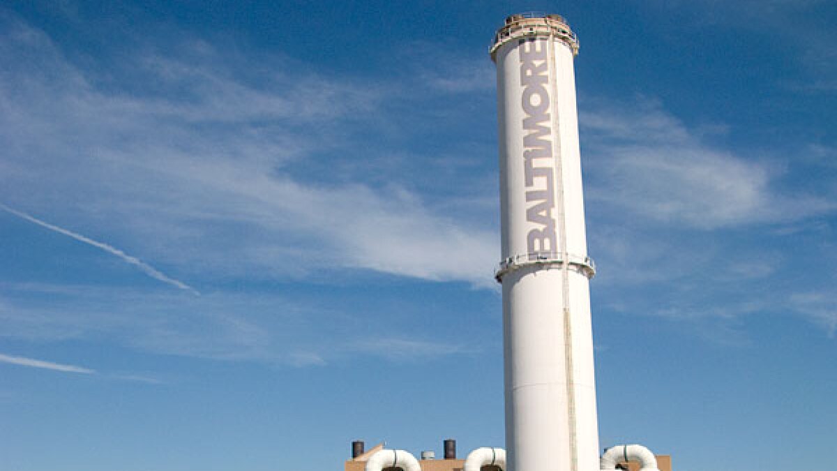
Wheelabrator Baltimore, the trash-burning incinerator at the center of this analysis.
How the slides go
- The question and why it matters
- The neighborhoods and the data
- What Wheelabrator emits, and how the wind moves it
- The main PM2.5 finding and what each monitor says
- The pressure-test: what else could explain the gap
- What I think it means, what I could not answer, what comes next
Context first, then the numbers, then the stress-test, then what I think it means.
Study Area and Neighborhood Groups
Three kinds of neighborhoods, picked for a reason.
The three groups
- 6 neighborhoods in the near both wheelabrator and i-95 group.
- 6 neighborhoods in the i-95 corridor only group.
- 4 neighborhoods in the control neighborhoods group.
- The "I-95 only" group is the key one. Those neighborhoods live with highway exhaust but the incinerator does not reach them. That is the baseline I am comparing Wheelabrator against.
- The control neighborhoods show what the air looks like with neither source dominating.
Data and Approach
Three data sources, and the same question asked of every day in the dataset.
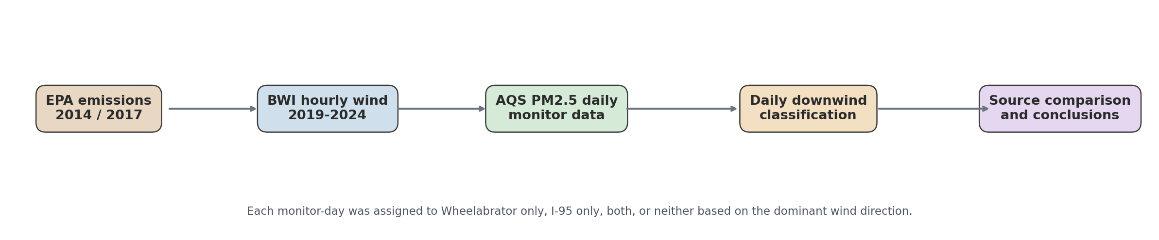
What went into the analysis
- Wheelabrator's own reported emissions, from EPA records, to show what the smokestack is putting out.
- Six years of hourly wind readings from BWI airport, to show where that pollution is going.
- Daily PM2.5 readings from EPA air monitors around Baltimore, to show what people are actually breathing.
- For every monitor and every day, I asked: was the wind carrying Wheelabrator plume toward this neighborhood? Was it carrying I-95 exhaust toward this neighborhood? Both? Neither?
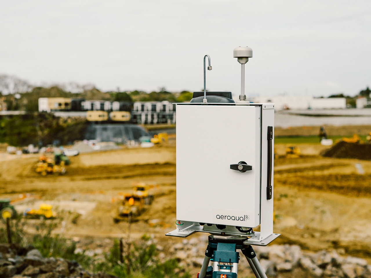
An EPA air monitor. Stations like this report the daily PM2.5 numbers I used.
Facility Emissions
What is the facility actually putting into the air, by the numbers.
I showed major pollutants in tons per year for 2014 and 2017.
The headline numbers
- Total reported emissions increased from 3,159,929 lbs in 2014 to 3,248,587 lbs in 2017 (+2.8%).
- NOx remained the largest reported pollutant by mass, while PM and PM2.5 both increased between inventory years.
- Trace pollutant changes were mixed: mercury and lead declined, while hydrogen fluoride and nickel increased.
Wind Patterns and Seasonal Transport
Wind is the bridge between the smokestack and the monitor. The rose below shows where Baltimore's wind actually comes from.
Wind dataset: 40,073 hourly observations from 2019-01-01 to 2024-12-30, average speed 3.66 m/s.
BWI airport, the single weather station whose hourly wind data feeds this whole analysis.
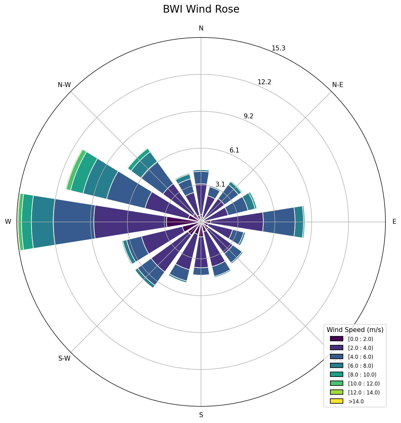
Main PM2.5 Finding
The headline result, split four ways by wind direction.
How to read this
- Wheelabrator-wind days averaged about 9.0 micrograms per cubic meter. Highway-wind days averaged about 6.3. That is a 43% gap.
- Days with wind from both sources landed roughly where the Wheelabrator-only days did. Days with wind from neither source dropped.
- The pattern points in the direction you would expect if Wheelabrator were adding something on top of the highway background.
Monitor-by-Monitor Wheelabrator Signal
The 43% gap is an average. Here is what it looks like monitor by monitor.
| Monitor | WB only | I-95 only | Delta |
|---|---|---|---|
| Lake Montebello | 9.25 | 6.20 | +49.1% |
| Oldtown | 9.71 | 6.92 | +40.3% |
| Padonia | 9.33 | 7.92 | +17.7% |
| Essex | 6.13 | 9.28 | -33.9% |
Three monitors lean the way you would expect. Essex goes the other direction, and I am treating that as a real counter-example, not an outlier to wave off.
Seasonal PM2.5 Pattern
The gap is not the same year-round. Here is how it shifts with the seasons.
What the seasons tell me
- In spring, fall, and winter, Wheelabrator-wind days run roughly 60% higher than highway-wind days. That is a clear contrast.
- In summer the gap mostly disappears. Summer PM2.5 is elevated across every category because regional pollution from outside Baltimore peaks in summer and drowns out the source-specific difference.
- That seasonal pattern cuts both ways. It is useful on its own, but it also hints that some of what I am seeing could be regional, not local.
Monitor Evidence Detail
The deeper dive. Pick a monitor and walk through the evidence behind its number.
Directional Overlap and Regional Transport
The slide that changed how I read my own result. Two things that make the 43% gap look smaller.
What the stress test turned up
- 71% of Wheelabrator-wind days also had southwesterly wind, the same wind that carries Ohio Valley and mid-Atlantic pollution into Baltimore.
- Only about 44% of highway-wind days were southwesterly. So regional pollution is stacking up on the Wheelabrator side of the comparison, not split evenly.
- At several monitors, "toward Wheelabrator" and "toward I-95" are basically the same direction. The two buckets aren't totally different weather.
| Monitor | Bearing to WB | Bearing to I-95 | Angular offset | WB-only SW share |
|---|---|---|---|---|
| Oldtown | 214° | 237° | 23° | 72% (28/39) |
| Essex | 251° | 226° | 25° | 17% (9/52) |
| Lake Montebello | 205° | 274° | 69° | 76% (109/143) |
| Padonia | 179° | 172° | 7° | 94% (78/83) |
Angular offsets at or below 45 degrees mean the WB-only and I-95-only wind categories overlap inside the tolerance window used by the classifier.
What this actually tells you
Here is the part I can defend from the data, and here is the part I cannot.
PM2.5 is higher on Wheelabrator-wind days
- On days when the wind was pointed from Wheelabrator toward Baltimore monitors, PM2.5 averaged 43% higher than on days when the wind was pointed from I-95 only.
- Three of four monitors lean the way you would expect if the incinerator is contributing. Oldtown was 60% higher, Lake Montebello 42% higher, Padonia 18% higher.
- The gap is largest in winter, spring, and fall. In summer it mostly disappears.
- Wheelabrator is a large emitter by the numbers: about 1,100 tons of nitrogen oxides and 760,000 metric tons of greenhouse gases in 2017 alone.
How much of the gap is actually Wheelabrator
- About 7 out of 10 Wheelabrator-wind days were also southwesterly days, and southwesterly wind carries Ohio Valley and mid-Atlantic pollution into Baltimore. A chunk of the gap is regional transport riding the same wind.
- At several monitors, "toward Wheelabrator" and "toward I-95" are basically the same direction, so the two buckets are not fully independent weather.
- One of four monitors (Essex) flipped the sign. If the method were clean, I would expect every monitor to lean the same way.
- This is a screening study, not a source-attribution model. It cannot say how many micrograms of PM2.5 came from the incinerator specifically.
Limitations and Recommendations
What this analysis couldn't do, and what I'd do next if I kept going.
What I couldn't do
- I couldn't separate Wheelabrator from regional pollution. The same southwesterly wind that brings the incinerator's plume to most monitors also carries Ohio Valley and mid-Atlantic PM2.5 into Baltimore.
- At some monitors, the direction toward Wheelabrator and the direction toward I-95 are basically the same. So the two buckets aren't fully different weather.
- I used one weather station at BWI for the whole metro area. Wind can be different a few miles away.
- I used daily averages, which smooth out short PM2.5 spikes.
- There are no EPA monitors in Westport, Cherry Hill, or Curtis Bay, the neighborhoods right up against the facility.
- The facility emissions I compared against are from 2014 and 2017 inventories, while the air quality readings are from 2019-2024.
What I'd do next
- Put fence-line monitors in Westport, Cherry Hill, and Curtis Bay, so the neighborhoods closest to the facility are actually being measured.
- Subtract a regional pollution background (from an upwind rural monitor, or a transport model) before blaming Wheelabrator for the remainder.
- Run this same directional method on sulfur dioxide and nitrogen dioxide. Those pollutants are more unique to local sources than PM2.5, so the fingerprint would be cleaner.
- Pair this with a dispersion model or with local wind fields for stronger source attribution.
- Refresh the emissions comparison with the most recent reporting data available.
References
- EPA National Emissions Inventory (2014 and 2017) for facility emissions.
- EPA Greenhouse Gas Reporting Program for Wheelabrator CO2e.
- EPA Air Quality System daily PM2.5 monitor data for Baltimore City and Baltimore County.
- Iowa Environmental Mesonet BWI ASOS hourly wind observations, 2019-2024.