Open the Narrative Presentation
A 13-slide directional analysis of Wheelabrator vs the I-95 corridor, with stress-tested conclusions. The dashboard below is the technical build log; the presentation is the story that sits on top of it.0. Data Pipeline & Technical Architecture
Every number and chart on this dashboard is produced by the same ordered pipeline. This section documents what runs, in what order, from which source, and where each artifact lands on disk.
Processing Order
Fetched by src/fetch_wind.py from the IEM asos.py endpoint for BWI (station=BWI, 2019-2024, hourly METAR reports). Columns kept: timestamp, wind_dir (degrees, meteorological convention: direction the wind comes from), wind_speed_kt, wind_gust_kt. Speed is converted to m/s on load. Cached to data/wind_bwi.csv.
Compiled in src/fetch_emissions.py from the EPA National Emissions Inventory (major & trace pollutants in lbs/yr) and the EPA Greenhouse Gas Reporting Program (facility ID 1004094, CO2e metric tons). Values live inline in the module because NEI downloads are annual snapshots. Converted to tons/yr at load. Written to data/wheelabrator_emissions.csv and data/wheelabrator_ghg.csv.
Fetched by src/fetch_aqs.py with an AQS API key (AQS_EMAIL, AQS_KEY in .env). Pulls daily summary data for PM2.5 (parameter 88101), plus PM10, SO2, NO2, Ozone, CO for Maryland FIPS 24, Baltimore City county 510, and Baltimore County county 005. Deduplicated to one daily value per monitor-date before downstream merges. Cached to data/aqs_*.csv.
For each AQS monitor, src/analyze.py:classify_wind_for_monitor computes the bearing from the monitor to Wheelabrator and flags each hour as "downwind of WB" when wind comes from that bearing ± 45°. classify_wind_for_i95 treats the highway as a line source: it finds the closest point on the I-95 polyline (I95_WAYPOINTS in src/config.py) using perpendicular projection onto each segment, then applies the same ± 45° rule. Hourly flags are aggregated to daily shares by merge_aqi_wind, and a day is tagged WB-only, I-95-only, Both, or Neither when its shares cross 50%.
directional_analysis and seasonal_directional_analysis compute mean, median, and 90th-percentile PM2.5 by category for each monitor and season. src/presentation.py then rolls those into the deck-level summary, the confounder stress-test (bearing overlap and SW-quadrant share of WB-only days), and the static PNG figures in presentation_assets/.
src/visualize.py emits the interactive per-monitor HTML (pollution roses, directional bar charts, time series, seasonal plots) and the static wind-rose PNGs into output/. app.py serves the dashboard, the presentation, the study map (a Folium render), and the cached artifacts. build.py captures the rendered Flask routes into docs/ for static hosting.
Module Map
src/config.py— facility coordinates, I-95 waypoints, neighborhood groups, pollutant parameter codes, the 45° tolerance window.src/fetch_wind.py— Iowa Mesonet request, parsing, kt→m/s conversion, CSV cache.src/fetch_emissions.py— inline NEI inventories, GHG values, long/wide helper frames.src/fetch_aqs.py— AQS REST calls, monitor discovery, multi-pollutant fetch with retry.src/analyze.py— bearings, angular differences, line-source projection, downwind classification, directional and seasonal aggregations.src/visualize.py— Plotly and matplotlib figures for the dashboard and the exported PNGs.src/presentation.py— deck context builder, confounder computation, PNG figure generator.run_all.py— the canonical pipeline runner.--wind-onlyand--no-aqsflags let you rebuild without the AQS API key.app.py— Flask routes for dashboard, presentation, study map, interactive charts, API endpoints.build.py— renders the Flask app to static HTML underdocs/for GitHub Pages.
Reproducing the Pipeline
- Register for an EPA AQS API key at
https://aqs.epa.gov/data/api/signupand putAQS_EMAIL/AQS_KEYin.env. - Install dependencies from
requirements.txt. - Run
python run_all.pyto pull wind + AQS, recompute the directional tables, and regenerate every chart inoutput/. - Run
python app.pyto serve the dashboard and presentation locally, orpython build.pyto freeze them intodocs/.
Re-running is idempotent: cached CSVs in data/ are used when available, and the get_presentation_context cache is keyed per-process so the presentation rebuilds its figures from the current CSVs on first render.
1. Study Area Map
Where the study neighborhoods are located, color-coded by exposure group. Red = near both Wheelabrator and I-95. Amber = I-95 corridor only. Gray = control areas.
Study Locations
16 NeighborhoodsExposure Classification
Study Groups| Neighborhood | Group |
|---|---|
| Westport | Near Both |
| Cherry Hill | Near Both |
| Brooklyn | Near Both |
| Curtis Bay | Near Both |
| South Baltimore | Near Both |
| Federal Hill | Near Both |
| Elkridge | I-95 Only |
| Savage | I-95 Only |
| Laurel | I-95 Only |
| Rossville | I-95 Only |
| White Marsh | I-95 Only |
| Aberdeen | I-95 Only |
| Canton | Control |
| Fells Point | Control |
| Dundalk | Control |
| Hampden | Control |
2. Facility Emissions
What Wheelabrator Baltimore reports emitting, from EPA National Emissions Inventory data (2014 and 2017).
How this section is built
The NEI values live inline in src/fetch_emissions.py as a {year: {pollutant: lbs_per_year}} dictionary, then flattened into a long-form DataFrame by get_emissions_df(). Tons/yr is just lbs_per_year / 2000. The GHG number comes from the EPA Greenhouse Gas Reporting Program (facility ID 1004094) via get_ghg_df(). The year-over-year deltas in the table above are computed client-side in the Jinja template from the same frame; the Plotly charts below are written by src/visualize.py:plot_facility_emissions into output/facility_emissions.html and output/facility_emissions_trace.html.
Wheelabrator Baltimore is the city's single largest stationary source of air pollution. Its SO2 emissions account for roughly half of all SO2 emitted in Baltimore City. The facility produces more mercury, lead, and greenhouse gases per hour than each of Maryland's four largest coal plants.
Major Pollutants
EPA NEI| Pollutant | 2014 (tons/yr) | 2017 (tons/yr) | Change |
|---|---|---|---|
| Nitrogen Oxides (NOx) | 1,075.8 | 1,101.2 | +2.4% |
| Sulfur Dioxide (SO2) | 310.9 | 308.1 | -0.9% |
| Hydrochloric Acid (HCl) | 73.7 | 78.4 | +6.4% |
| Carbon Monoxide (CO) | 66.0 | 74.9 | +13.5% |
| Particulate Matter (PM) | 24.9 | 29.0 | +16.5% |
| Fine Particulate Matter (PM2.5) | 23.1 | 27.3 | +18.2% |
| Formaldehyde (CH2O) | 2.0 | 2.0 | 0.0% |
| Volatile Organic Compounds (VOC) | 3.3 | 2.7 | -18.2% |
Trace Pollutants
Heavy Metals & Toxics| Pollutant | 2014 (lbs/yr) | 2017 (lbs/yr) | Change |
|---|---|---|---|
| Hydrogen Fluoride (HF) | 482 | 1,019 | +111.4% |
| Lead (Pb) | 294 | 247 | -16.0% |
| Mercury (Hg) | 53 | 29 | -45.3% |
| Nickel (Ni) | 17 | 92 | +441.2% |
| Hexavalent Chromium (Cr VI) | 4 | 2 | -50.0% |
Source: EPA National Emissions Inventory, 2014 & 2017
Major Emissions Chart
InteractiveTrace Pollutants Chart
Interactive3. Wind Patterns
Wind direction and speed distributions from BWI airport (2019-2024). These show where emissions are likely carried. Click any rose to view full size.
How this section is built
Hourly observations are pulled by src/fetch_wind.py:fetch_wind_data from https://mesonet.agron.iastate.edu/cgi-bin/request/asos.py for station BWI, report type 3 (routine METAR), for each year between DEFAULT_START_YEAR and DEFAULT_END_YEAR. The response is parsed into columns timestamp, wind_dir (degrees, direction wind comes from), and wind_speed_kt; speed is converted to m/s on load. The 16-sector wind rose PNGs are rendered by src/visualize.py:plot_wind_rose and plot_seasonal_wind_roses using matplotlib with polar projection; the per-sector shares are also exposed to the presentation via wind_summary.sector_share in src/presentation.py.
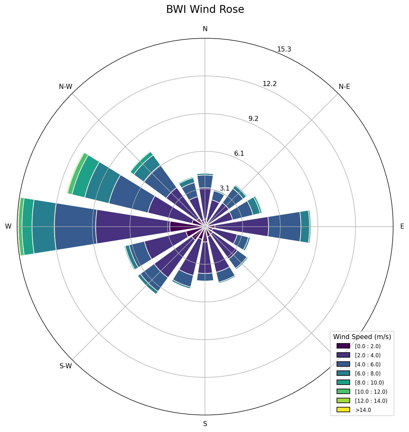 Overall
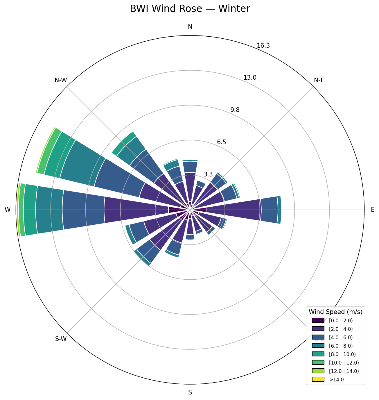 Winter
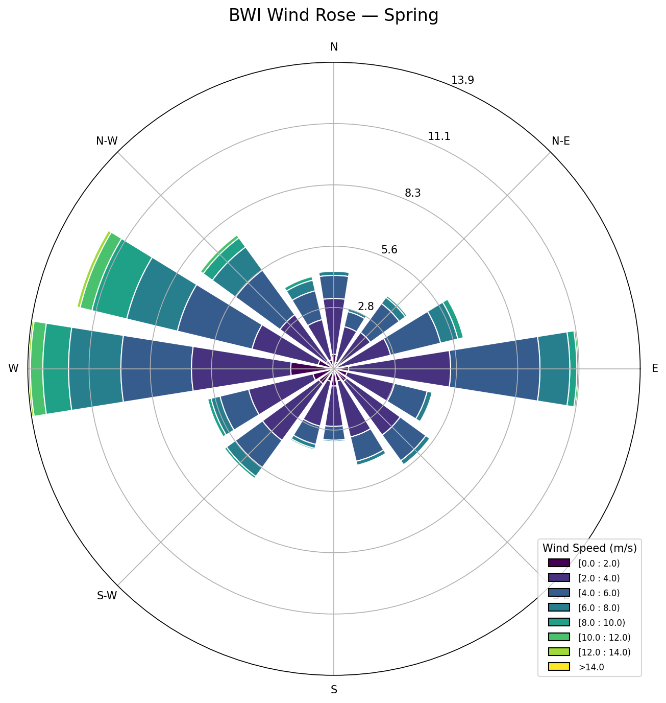 Spring
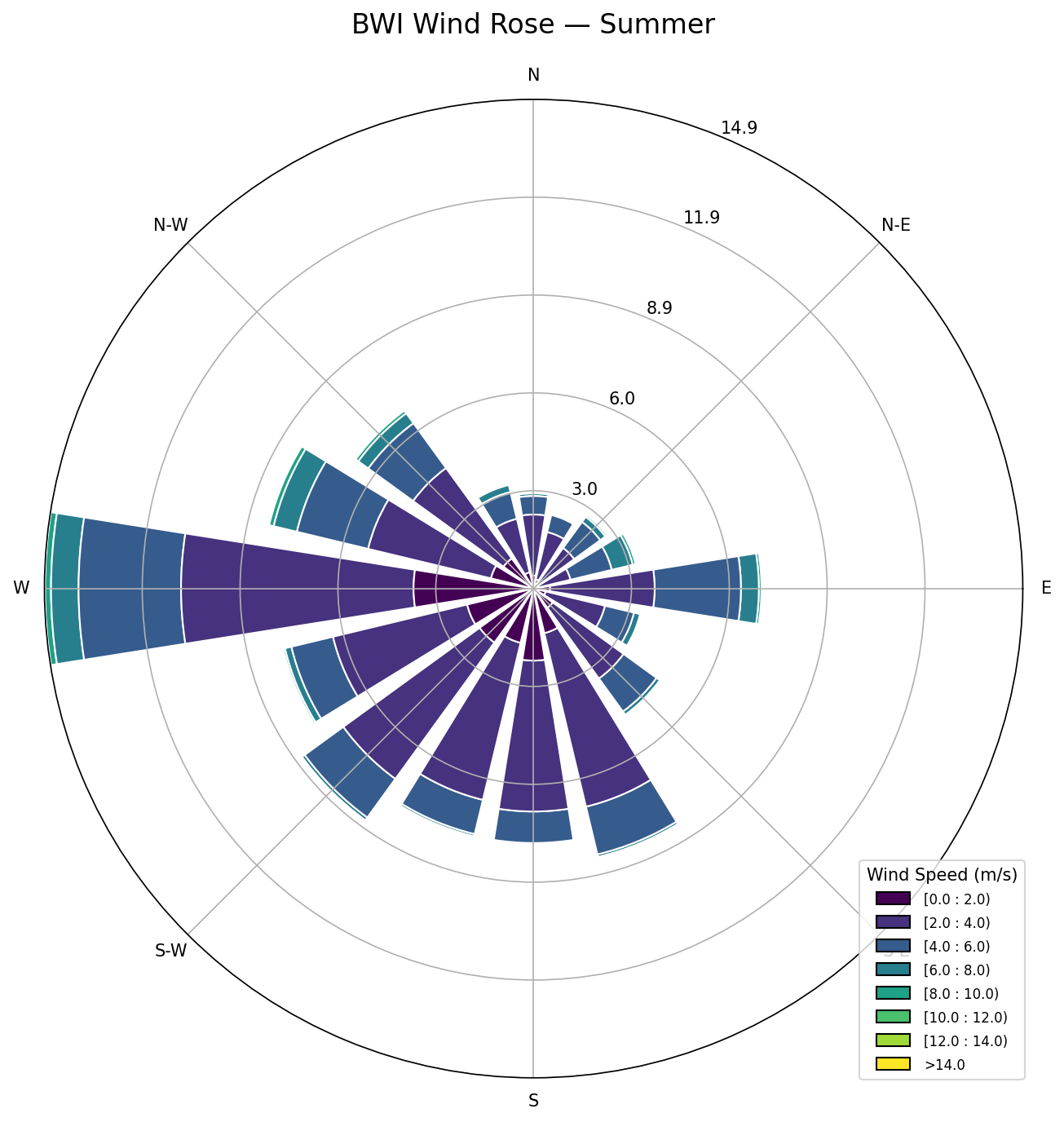 Summer
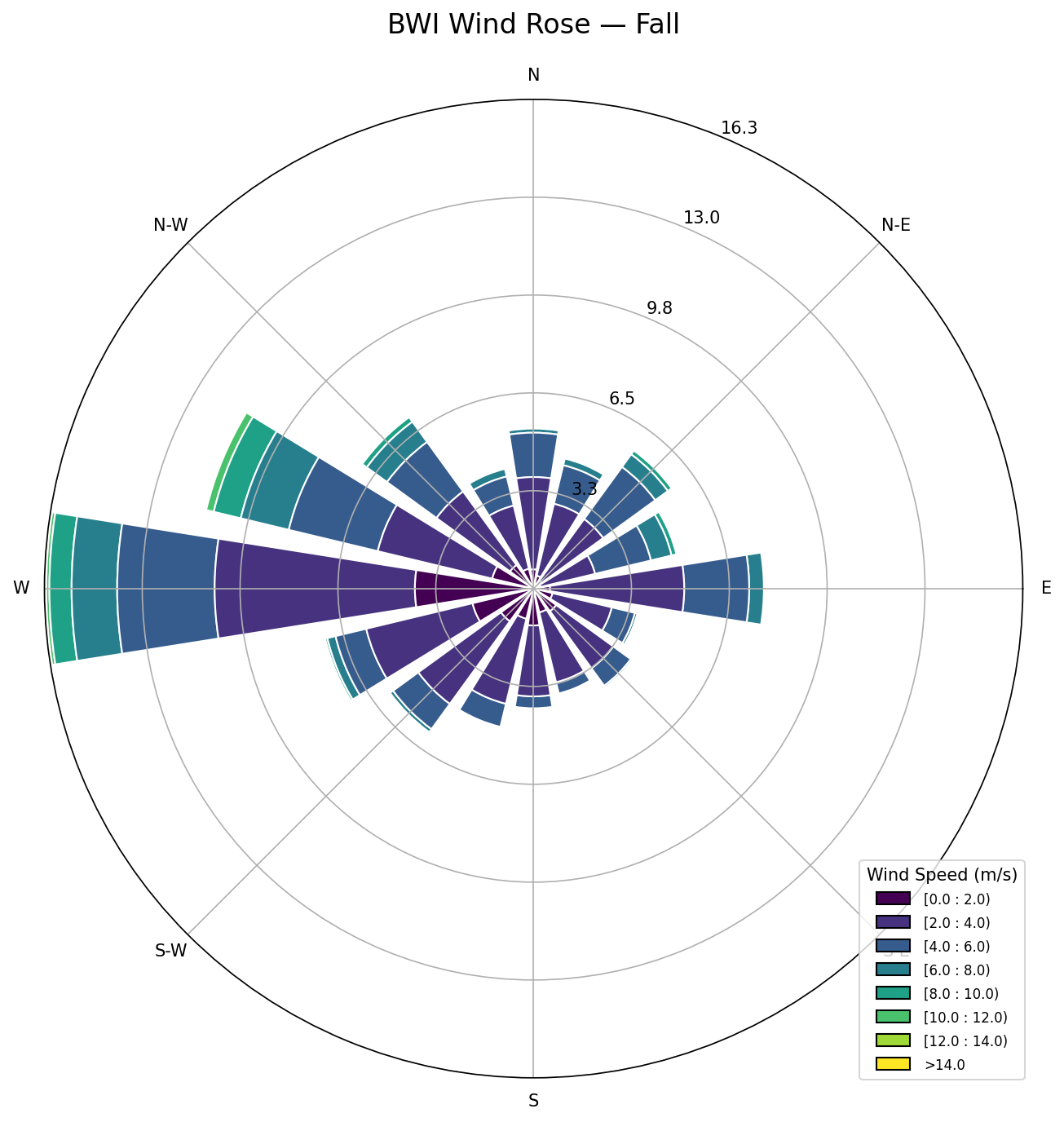 Fall
Fall
4. Pollution Roses
Mean measured pollutant concentration by wind direction at each EPA monitor. If pollution is higher from one direction, these roses will show it.
How this section is built
For each AQS monitor discovered in data/aqs_monitors.csv, src/visualize.py:plot_pollution_rose bins the merged monitor-day records (from merge_aqi_wind) by the daily mean wind direction and plots mean PM2.5 per 22.5° sector as a Plotly polar bar chart. One HTML is emitted per monitor at output/pollution_rose_<lat>_<lon>.html and iframed in the cards below.
Monitor 39.30, -76.60
PM2.5Monitor 39.31, -76.47
PM2.5Monitor 39.34, -76.59
PM2.5Monitor 39.46, -76.63
PM2.55. Directional Comparison
Side-by-side comparison of pollutant levels when monitors are downwind of Wheelabrator, downwind of I-95, downwind of both, or downwind of neither.
How this section is built
Each monitor-day is tagged using the pct_downwind_wheelabrator and pct_downwind_i95 shares from merge_aqi_wind: a day is WB-only when the WB share > 0.5 and the I-95 share ≤ 0.5, and symmetrically for the other three categories. src/analyze.py:directional_analysis aggregates mean/median/p90 PM2.5 in each bucket, and src/visualize.py:plot_directional_comparison renders the four-bar Plotly chart per monitor. The presentation-level version of this comparison, plus the confounder stress-test (bearing overlap + SW-quadrant share) lives in the presentation deck.
Monitor 39.30, -76.60
WB vs I-95Monitor 39.31, -76.47
WB vs I-95Monitor 39.34, -76.59
WB vs I-95Monitor 39.46, -76.63
WB vs I-956. Time Series
Daily pollutant readings over time, colored by whether the monitor was downwind of Wheelabrator, I-95, both, or neither that day. Includes 30-day rolling averages.
How this section is built
src/visualize.py:plot_time_series takes the merged monitor-day frame, applies the same four-way categorization used in the directional charts, and plots daily PM2.5 as a scatter with category-colored markers plus a 30-day rolling mean as an overlay. Gaps correspond to monitor-days dropped during AQS deduplication or to dates missing from the BWI wind record.
Monitor 39.30, -76.60
Daily ValuesMonitor 39.31, -76.47
Daily ValuesMonitor 39.34, -76.59
Daily ValuesMonitor 39.46, -76.63
Daily Values7. Seasonal Breakdown
The same directional comparison broken down by season, to see if the Wheelabrator vs I-95 pattern varies with weather and wind shifts.
How this section is built
src/analyze.py:seasonal_directional_analysis tags each monitor-day with a season (DJF / MAM / JJA / SON) and re-runs directional_analysis inside each season. src/visualize.py:plot_seasonal_comparison renders the resulting grouped bar chart per monitor. The presentation-level seasonal line chart on Slide 9 is the same data aggregated across monitors.
Monitor 39.30, -76.60
By SeasonMonitor 39.31, -76.47
By SeasonMonitor 39.34, -76.59
By SeasonMonitor 39.46, -76.63
By SeasonData: EPA National Emissions Inventory, EPA AQS, Iowa Environmental Mesonet — Wheelabrator Baltimore / WIN Waste, 1801 Annapolis Rd, Baltimore MD 21230